CDN Insights
SITE CDN Insights
SITE CDN visuals provide real-time insights into your CDN instance’s performance and traffic, helping track trends, identify issues, and optimize content delivery, speed, and resource use.
- Performance Tracking Monitors traffic and response times to enhance website speed and performance.
- User Behavior Insights Analyzes traffic sources, devices, and popular content for better targeting.
- Real-Time & Historical Data Analysis Provides live and past performance trends for data-driven decisions.
- Reduced Downtime & Faster Troubleshooting Identifies errors and inefficiencies for quick resolution.
- User-Friendly & Insightful Design Provides intuitive filters and visual insights for seamless CDN management.
Breakdown of CDN Dashboard Visuals
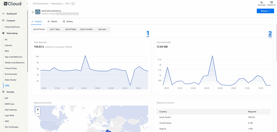
The CDN dashboard includes a time range filter that lets you analyze performance over different periods (last 24 hours, Last 7 days, Last 30 days, Last 6 months, or Last year) to track trends and optimize content delivery. In this section, we’ll walk through each visual and how it helps you monitor, optimize, and enhance your content delivery.
1. Total Requests (Line Chart) Displays the total number of requests over the specified time period.
2. Total Bandwidth (Line Chart) Displays the total amount of egress bandwidth (the data sent from the CDN edge servers to end users) over the specified time period.
Both visuals show the total based on the selected time range:
- Last 24 hours – Total per hour.
- Last 7 days – Total every 6 hours.
- Last 30 days – Total per day.
- Last 6 months – Total per week.
- Last year – Total every 2 weeks.
These insights help you monitor traffic trends, optimize resource usage, and detect unusual spikes or drops in CDN activity.
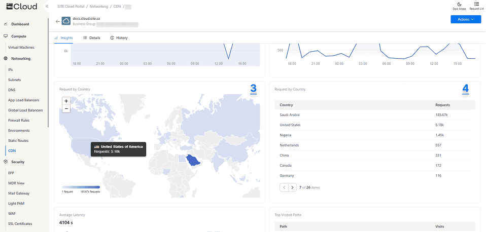
3. Request by Country (Geomap) Displays an interactive visual representation of where requests originate. Hovering over a country shows the total number of hits from each country.
4. Request by Country (Table) Presents the same data in a structured table format, listing each country alongside the number of requests.
These visuals help you understand geographic traffic distribution, and detect unusual access patterns.
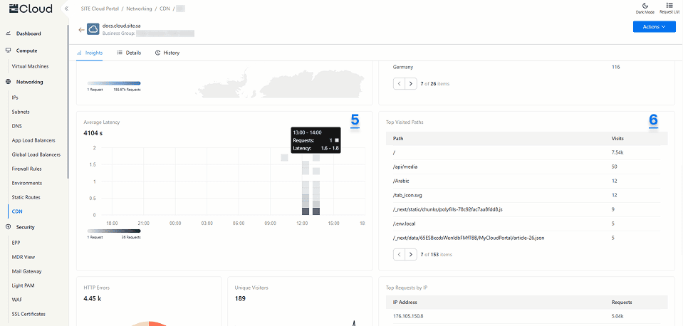
5. Average Latency (Heatmap) groups data into buckets, where each bucket represents:
- Number of Requests – The color intensity darkens as the number of requests in the bucket increases.
- Latency Range – Requests within the bucket fall into a specific latency range.
- Time Interval – The bucket’s time range is based on the selected time filter:
- Last 24 hours – Buckets per hour.
- Last 7 days – Buckets every 6 hours.
- Last 30 days – Buckets per day.
- Last 6 months – Buckets per week.
- Last year – Buckets every 2 weeks.
This visual helps users detect performance trends, identify latency spikes, and optimize response times efficiently.
6. Top Visited Paths (Table) Displays each path or page within your origin along with the number of visits in a tabular format. This helps you compare high-traffic and low-traffic pages, allowing you to adjust your content strategy accordingly.
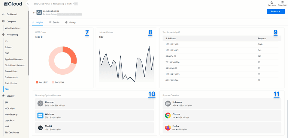
7. HTTP Errors (Pie Chart) displays the total number of 4xx client-side errors and 5xx server-side errors based on the selected time range filter. This visual helps you quickly identify error trends, troubleshoot issues, and improve request handling to enhance the overall user experience.
8. Unique Visitors (Spark Line) Shows the total count of unique IPs that have accessed your website during the selected time range. This interactive chart allows you to hover over each point to view detailed data, helping you track how many different users are visiting your content and at what times.
9. Top Requests by IP (Table) displays the total number of requests made by each IP address within the selected time range. This helps you identify high-traffic sources, detect potential abusive or suspicious activity to enhance security and performance.
10 & 11. Operating System Overview and Browser Overview visuals show the percentage of requests as well as the total count of requests based on the operating system and web browser used. These insights help you understand which platforms and browsers users are using to access your content.